Showing posts with label Concept Art. Show all posts

Friday, 18 March 2016

3D Modelling: Time Machine Design


Part of the reason why I wanted to create something like this is because I thought I needed to make something a bit more complicated than what I did with the column, in hope that I may be able to showcase more.. ability I guess, even though I'm still having a bit of trouble with the low poly model of the column. So I hope I figure it out and am able to do this to the time schedule. Another reason as to why I would like to make a glove type thing, instead of a watch-like object is I thought I may as well use this time to try drawing hands!


At the first creation of the design, each finger had a sharp end to it, however I restricted it to just the index finger. My idea is that once the time/date is set then the user draws into thin air, 'ripping' open a seam which they can them step through. I may reduce these to just the sharp one for the index finger. These initial designs don't show it very well but they, or it, will be linked inside the glove, and as the glove is quite old, it would be tattered, therefore the wires or connection inside it would be seen. I'd like to spend a lot more time on 2D, well as much as I can but that is far too much time and I need to move onto creating the model in Maya.
I have not quite yet decided what the cuff's material will be but I am leaning more towards metal rather than leather. Why I decided on leather initially was so that the metal dial would stand out more on the cuff. Perhaps instead of the chain link type things on the wrist side of the bracelet, I will use metal to connect it (this is where the bracelet snaps on after putting on the glove part), and if I were to do that then the leather would make a much more ideal material.


I guess modelling this on Maya would be easier to do it over a hand but I think if I got the measurements and proportions right, it wouldn't really matter... I just hope that I can.

Sunday, 28 February 2016

3D Modelling: Column Design and Model


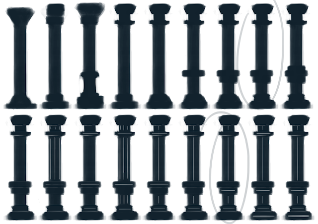
These are some of the references I used to create ideas for my column.

I wanted to do something simple so I could focus on the technical side of things and get the hang of the process before doing things more completed which I know would only stress me out...
Primitive Preview

After creating different iterations, I set on modelling the column in Maya.

I don't know if it's the simple design I chose or the fact that I may not be no longer such a beginner with Maya but things like adding edge loops and snapping shapes to others seemed much more easier than the other times I used Maya.

Although this design isn't a difficult one, making this piece has given me more confidence to create something more elegant with more features in the future. I know understand more about how to do things and the features and keys/shortcuts  in Maya and what they do and how to use them.

I'm still not very confident though, but I think I'm getting there. I just need more practice.. and more time!

Front View
Side View
Smooth Preview

Friday, 13 November 2015

Concept: Character Final Painting


The background of this painting did not turn out as well as the background of the timepiece final painting. I wanted to try something different and have the path trail off into the distance, however I did not do this well. I wanted to show the light coming from behind the figure and that she is walking into the woods which would be obscured by darkness.
I did paint in trees between the larger ones in an attempt to show an understanding of Aerial Perspective, however they did not come out in the JPEG image.

Concept: Character Character Sheet

This is a Character Sheet for my version of the Witch from the Tinderbox depicting her in various parts of the story. It shows how she interacts with the soldier, holding herself up higher than usual as shown in her standard pose whilst sitting. This is because she still has her pride and wants to maintain the class she once had. The third figure shows her at the end of the story.

Concept: Character Model Sheet

This is the Model Sheet for my character.

Concept: Character Base Colour Iterations


These basic colour concepts were so that I could get a rough idea of what base colour I wanted before adding the shading to make the clothing look degraded or worn. This is in addition to me having changed the dress and hair to a more ragged design already.

Concept: Character Hair Iterations


I tried to create designs with elegance, which suggests an upper-class nature to the woman. After I decided on the style I would then go on to make the hair look more rough and displaced to give the idea that she no longer holds the position she used to.
I chose the dark red hair as it was more interesting than the black and brown, and I wanted it to be slightly unusual to what colour the hair typically was in that time to subtly show that she was a witch or at least different.

Concept: Character Simple Clothing Designs


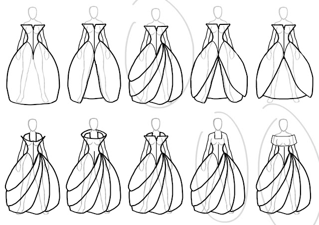
Having settled on the idea of a youthful-looking-yet-aged witch, I then proceeded in creating clothing silhouettes. All of these are dresses as those were popular in this time for women, I just needed to decide on what style I wanted to use.
I kept narrowing down the designs to the choices I preferred and even created iterations of the shoes underneath the dress.

The design of the bottom of the dress I chose was not a typical dress in the 1800s, however I thought it would work well.


Vam.ac.uk, (2015). History of Fashion 1840 - 1900 - Victoria and Albert Museum. [online] Available at: http://www.vam.ac.uk/content/articles/h/history-of-fashion-1840-1900/ [Accessed 13 Nov. 2015].
Vintagefashionguild.org, (2011). Vintage Fashion Guild : 1800s. [online] Available at: http://vintagefashionguild.org/1800s/ [Accessed 13 Nov. 2015].
Women in the American Society: Over the Years, (2015). Fashion in the 1800's: Modesty. [online] Available at: http://womenintheamericansocietyoverthe.weebly.com/fashion-in-the-1800s-modesty.html [Accessed 13 Nov. 2015].


citethisforme

Concept: Character Silhouettes


These are silhouettes created with the Witch from The Tinderbox in mind. My time and place was 1800s America and so my first thought was to create a native American female, however as I carried on with this process the idea changed to a figure of an upper-class woman. This is because I thought more about the concept and a background to the character in this stage. I wanted to portray a youthful looking witch who had fallen from grace years before.

In this third project, I think I improved a lot more in creating silhouettes and making figures from the shapes I saw.

Sunday, 8 November 2015

Concept: Timepiece Final Painting


The final painting of the timepiece turned out much better than that of the insect. I had more practice and got used to using a tablet again, however I can't help but feel that a night scene is simpler to paint than day. Shadows are something I still need to work on, although I think the sun and the colour of the background works well.

Even from the initial stage of the paining process, it is evident that starting this, I was much more confident than I was while starting the insect painting. I wanted to create a night scene using inspiration from Stonehenge as the light from the timepiece would be effective in this location and it would be easier to see.
When I created the sun setting, I worked several layers into it, making it seem illuminated and then painted around around the areas, blending it just enough to make it look like rays. I then made the sky and grass areas darker where the light would not reach.
To emphasise that we are looking at straight on with the sun rising, I added hints of orange and yellow along the horizon.
Due to the view point of the painting, the timepiece is seen head on and should be obscured in darkness as the sun is behind the object. This stage does not reflect it as I knew that there would be light emanating from the object itself.
In this stage, I textured the timepiece as included the coloured light from the object, illustating that it should be 6:45AM and added the shadow. There is also more shading on the timepiece as a better reflection of where the light is coming from.


I took inspiration for the background from
Allthesky.com, (2015). Stonehenge - Observatories - Digital Images of the Sky. [online] Available at: http://www.allthesky.com/observatories/stonehenge.html [Accessed 13 Nov. 2015].

Saturday, 7 November 2015

Concept: Timepiece Model Sheet


This is a rough model sheet for my timepiece, hopefully showing how it works.
Finding a good colour for the background was difficult and I still don't think this is the ideal shade, however any lighter shades made the timepiece difficult to see and darker shades were hard on the eye..

The front and back views have the red and purple lighting for each half of a day and shows that the sections which aren't meant to be lit would still have some light shining and bouncing onto it, although this lighting would not be as prominent and 'full' as that which is meant to be used to tell the time. The side view of the timepiece show that the middle section protrudes from the middle of the areas. These views also show that the rings are all 'inside' each other, and doesn't spiral inwards.

Concept: Timepiece Simple Detail Iterations


I used a template to figure out what type of base I wanted to use with the timepiece levitating above it. The two main material ideas are granite and marble; I thought dark and light bases would work best due to the idea of wanting coloured light to reflect the time of day. I like the Nero Maltese granite more than the others and I like the majority of the marble bases, however, due to the coloured light idea, I chose a white one and worked on it more to see how the reflections would look.

I really like the reflection of the light on a black surface as the brightness of the colour works well on the dark surface. Although these are rough detailed ideas, I like the brush used to create the granite-like texture and thinks it works well.


The white marble base looks more clean than the dynamic black, however the rings were altered from black to two shades of grey as the black rings didn't seem to go well with this base than the black base. The light grey works better with the white base than the other two colours, but if I were to choose this grey then I would add some white into the rings to match it with the marble base. If I were to choose the marble base then I would not use the black rings.
Overall, I think it's between the granite black rings and the light grey marble rings.

The colour of the light for midnight to noon and noon to midnight will be different, illustrating which 6 o'clock (6th ring lit up) it is. These colours needs to be carefully considered as it needs to be prominent enough to be noticed in the day light, therefore I would not use yellow or orange, nor blue due to the brightness of the surroundings outside usually from roughly 6am to 6pm.
It will probably be red for midnight to noon and purple for noon to midnight.

Tuesday, 3 November 2015

Concept: Timepiece Further Designs


I placed 6 choices from the previous silhouettes onto a separate page in order to see it without the clutter of the other designs around the ones I would possibly like to look at in more detail. From these 6, I chose to define a few of which I think I would prefer.

Iterations of one of the designs were then created. I toyed with the idea of having multiple sections for hours, minutes and seconds, different layers and ways of making the water idea plausible. After the water idea turned out not to be realistic (something which I would feel comfortable with), and I had dabbled in the idea of using a type of magic to make the timepiece work, I decided to use lights instead. I created a timepiece idea with layers with the light idea but have yet to decide what it should stand on.

Concept: Timepiece Silhouettes


We were asked to create a Timepiece for the second task. Timepieces can take many forms and can be powered by many different things. I toyed with the idea of creating something which was powered by the growth and process of life.
My initial idea was to create a tree whose apples fell and decayed throughout the course of a day. This way, a person would be able to tell what time of day it was by seeing how decayed the apple was. There were some issues coming into this though; Realistically, the apple would be likely to break after falling from the tree, so I added a pool or a trench of water to catch the fruit.
Other ideas have included a landmark with a waterfall mechanic, a dress or flower which decayed over a period of time and several statues which turn into different numbers or shapes depending on the time.
I settled on trying different alterations of the round glass like figure filled with water. This would empty out somehow during the day. 


These are designs and patterns drawn on Alchemy, all of which used the mirrored option.
Although I like all of these designs, all of them look as though they would be a statue or a monument from a sci-fi type setting. The middle left design looks like something from an alien-esque setting and the one in the top left looks as though it is of a woman one would worship. The rest of the bottom two rows look as though they are settings of combat or profiles of warrior like figures.
The designs didn't suit what I had imagined a timepiece to look like. It was fun creating things in Alchemy and although I didn't end up wanting to use any of them, it let me explore different areas and perhaps I will use these as inspiration to look back on for other briefs.

Tuesday, 27 October 2015

Concept: Insect Final Painting


Backgrounds and shadows are things that I need to work on in general.
I feel as though I have not utilised the colours fully in order to make the insect stand out among the background.

You can see from my painting stages and even brush strokes that I was very uncomfortable with digital painting although I was not completely new to the concept. I had no idea where to start this painting.

I chose these colours to show what type of environment I think my insect would thrive in. Instead of standing on a leaf or a branch, my insect is standing on a mossy rock, as it is what would camouflage it best.

I think the lighting is relatively okay due to my lack of experience, although it may be because of that that I could have been afraid to do anything more to it, so I need to practice and become more confident. In both the lighting and painting in general.

Monday, 19 October 2015

Concept: Insect Character Sheet


This sheet shows the ways the insect interacts in its life.
The wing movements show how far up and down the wings go for it to fly and the positioning on its body.

This insect doesn't have a mouth so the way it eats and survives is to 'absorb' smaller insects or flies which land on the body through the cracks. Due to the camouflaged design and mossy nature, smaller insects would land and be trapped in the coating before being consumed into the body.

Monday, 12 October 2015

Concept: Insect Simple Detail Iterations

These are coloured simply with slight texture and shading, mainly to gain a better idea of what a design would look like and be able to help in the decision making of which one to recreate in more detail and then to incorporate it into a final piece.

I preferred the ice and mossy rock creations over the two metal-esque ones. This is mainly due to those designs giving me more ability to be more creative over what I'm doing, whether it be the colouring or also the look and style of the insect. Of these two, I prefer the mossy rock one as I have more of an idea as to where the insect will live and its chances of obtaining food to survive, and I also like the idea of being able to create a proper mossy texture on the creature.

Thursday, 1 October 2015

Concept: Insect Base Colour Iterations

Base Colour Trials
I replicated each rough model and design but altered the colour to see which I thought would best suit the insect. This also helped me think about what type of environment each design would inhabit.
I narrowed the trials down to 4 possibilities of designs which I may want to work deeper into, colour-wise and with more detail, though I'm still undecided about whether or not I would like these 4 as I reckon the Volcanic Rock one would work well as well.

Tuesday, 29 September 2015

Concept: Insect Silhouettes


We started creating silhouettes using a thick low opacity brush. Most of the silhouettes were shapes and lines which were then refined or built upon, making a more insect like creature.
Once I had found one which I thought I could work on, I set about honing the shapes into features I could develop more using different materials, textures and colours. I proceeded to create front and back views of each design.